


Originally published on Postperspective
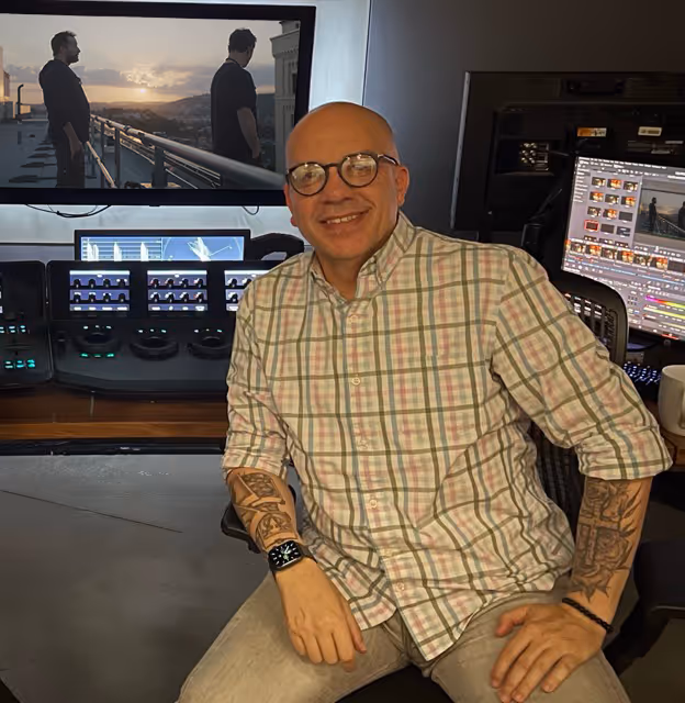
Paul Allia is a senior colorist at Picture Shop, a full-service post facility that supports series, features and commercial projects across global locations, including Los Angeles, Vancouver, Toronto, New York, Bristol and London.
Allia, who is now based in Picture Shop’s newly opened Toronto facility, has worked as a colorist primarily on TV series throughout his career. In that time, he was nominated for an HPA Award for Outstanding Color Grading for his work on Damnation, which was shot by Thomas Yatsko, ASC. He has also worked on shows such as Dustin Lance Black’s When We Rise, Big Sky, Stargirl, and Netflix’s On My Block, which was Picture Shop’s first project to be graded in HDR.
Let’s find out more from Allia.
As a colorist, what would surprise people the most about what falls under that title?
Many people think the job is only about adjusting color, but a lot of the work is shaping mood, guiding the viewer’s eye, creating continuity and helping support the emotional tone of the story.
Are you sometimes asked to do more than just color on projects? Has your job evolved at all beyond color?
Yes, the role has expanded significantly over the years. I am often brought in early alongside the cinematographer for camera tests, exposure planning and look development. When we begin grading, I’m also asked to assist with image cleanups, beauty work, sky enhancements and visual touch-ups that help the final result feel seamless. Today, a colorist is a creative partner to both the director and cinematographer in the finishing process, not just a technician.
What are some projects you have worked on?
Recent projects include The Pitt, Happy Face, The Cleaning Lady and Rabbit Hole, along with many others during my time at Picture Shop Los Angeles.
What can be challenging from your perspective?
A common challenge is a scene shot over several hours where the light changes dramatically. Balancing exposure shifts and color temperature differences while keeping the scene seamless and emotionally consistent requires a careful, controlled approach.
How do you prefer to work with the director of photography and the director?
I enjoy a collaborative approach. The best work comes from open communication and a shared understanding of what the story requires. Being included early in the process helps a great deal because it allows us to agree on the visual language and build a look that guides the entire production. Once we are in the grading suite, I appreciate it when the director or cinematographer communicates the feeling they want the image to convey so I can translate that into the grade.
How do you prefer the director of photography or director describe the look they want?
Visual references are extremely helpful, whether they are photographs, paintings, film frames, ShotDeck references or anything else that conveys mood. Even a few descriptive words can be enough to get us aligned. I also create custom LUTs, so discussing contrast and color response before shooting often leads to a stronger and more consistent final result.

Any suggestions for getting the most out of a project from a color perspective?
Involving the colorist early always pays off. Conducting tests with cameras, lighting, makeup and wardrobe helps establish a consistent look. Maintaining stable exposure on-set is important. Providing a clear and organized turnover with proper metadata is also a big time-saver. Most of all, leaving room for experimentation in the suite often leads to discoveries that elevate the project.
Do you provide LUTs for on-set?
Yes. I create custom LUTs for many of the productions I work on. It gives the director of photography and the entire crew a reliable visual reference from Day 1, and it leads to a smoother grading process in post.
How does your process change when working on a feature film, an episodic series or a commercial?
Each format has its own rhythm. A feature film allows for deeper exploration of the visual language and more time to refine subtle details. Episodic work focuses on consistency across many episodes along with tight schedules and careful pipeline management. Commercials tend to move quickly and place a strong emphasis on polish, impact and creative boldness. The goals shift, but the fundamentals of good color are the same.
What system do you work on?
I grade using Blackmagic DaVinci Resolve Studio with a calibrated reference display and a full control surface.
What’s your favorite part of color grading?
That moment when everything aligns and the DP, director and I all look at the image and feel the same thing. When the story’s emotion clicks into place visually, it’s incredibly rewarding. I also genuinely enjoy the collaboration itself. Sitting in a room with talented people and elevating their work never gets old.
Do you have a least favorite part?
Unorganized turnovers or mismatched media can slow the process down, but once everything is streamlined, the creative work becomes the focus again.

Why did you choose this profession? How early did you know this would be your path?
I have always been drawn to images and the emotional impact of color and light. Early in my career, I realized I had a strong sensitivity to tone and contrast. When I discovered color grading, I immediately felt that everything about the craft suited me. It combines artistry, storytelling and technical expertise. I have been a colorist for more than 20 years, and I still love it.
If you did not have this job, what would you be doing instead?
I would likely still be connected to visual storytelling in some form. Photography, editing or mentoring young filmmakers would be natural directions for me.
What is the project you are most proud of?
I am proud of several projects for different reasons, and each one represents a meaningful collaboration. Projects such as Damnation, On My Block (which was the first HDR project ever graded at Picture Shop), Rabbit Hole and Happy Face stand out. Each one challenged me creatively and allowed me to work with exceptional directors and cinematographers.
Where do you find inspiration?
I find inspiration in photography, fine art, classic cinema, modern cinematography and even everyday lighting. I often pay attention to how natural light behaves in real environments because those observations help guide the honesty of the image.
Is there a feature film that stands out to you as an example of great color?
Several classic features from the past two decades continue to inspire me. Films such as Road to Perdition, The Assassination of Jesse James by the Coward Robert Ford, Amélie, Children of Men, Collateral, Master and Commander: The Far Side of the World, There Will Be Blood, Memoirs of a Geisha, The Curious Case of Benjamin Button and The Constant Gardener all feature exceptional color work that still feels timeless.
Any tips or tricks you would like to share?
Begin with contrast before shaping color. Always trust your eye, but confirm with scopes. Step away when your eyes are fatigued because fresh perspective is essential. Most importantly, allow the grade to support the emotional intention of the story rather than overpower it.
Any tips for the clients you are working with? Any best practices?
Visual references help streamline the process. Communicating emotional goals is just as important as technical notes. Providing a locked cut when possible is always appreciated. Allowing the base look to settle before refining also leads to stronger decisions. Above all, remember that the colorist and the filmmaking team are aiming for the same outcome, which is a cohesive and memorable final image.
Can you name some technology you cannot live without?
A calibrated reference monitor, a reliable control surface, accurate scopes, strong storage and Resolve are essential tools in my workflow.
This is a high-stress job with deadlines and client expectations. What do you do to de-stress?
I try to disconnect from screens and reconnect with real life. Physical activity, spending time with family and getting outdoors help clear my mind. Maintaining balance outside the suite allows me to stay focused and creative when I am in it.