


Picture Shop Supervising Colorist Peter Doyle has spent more than 25 years building the looks of films from Faust to Creed III. His latest is Digger.
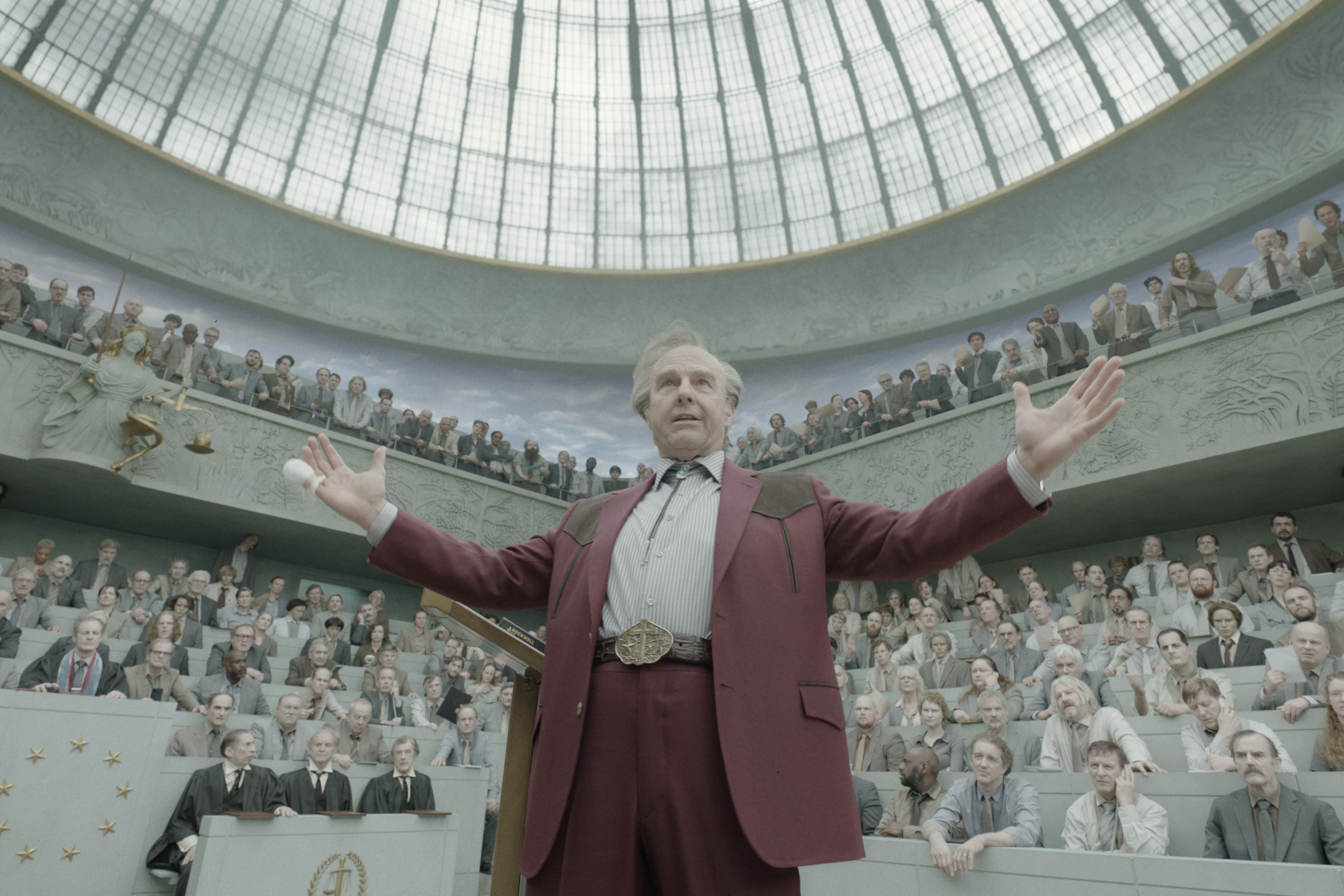
"For me, references are where the conversation starts, not where it ends. You're learning the visual language of a reference and then using that language to say something new. The goal is a unique image, not a homage. You want to innovate, not renovate," says Peter Doyle.
Doyle is one of the most influential colorists in the industry and a pioneer of digital look development. From creating custom software to grade scenes of The Matrix to the first digital DI on The Lord of the Rings trilogy, Doyle has built a career innovating but never just for the sake of innovation. Films he has graded have earned five Oscar nominations for cinematography and eight for visual effects, and he has graded four of the Oscar-nominated films shot by Bruno Delbonnel, ASC, AFC, including Inside Llewyn Davis, Darkest Hour and The Tragedy of Macbeth. He is a member of the Academy's Production and Technology Branch and an associate member of the ASC.
His newest work is Digger, Director Alejandro G. Iñárritu's film starring Tom Cruise.
Look Development: Start with the story and the team
"My approach to color is always about understanding what the DP is trying to achieve with their light, what the director is striving for with the tone of the performance, and what the production design has built," Doyle says. "A film is not just about the color. It really is, surprisingly, about the story and the actors. Everything else is really just the support for that."
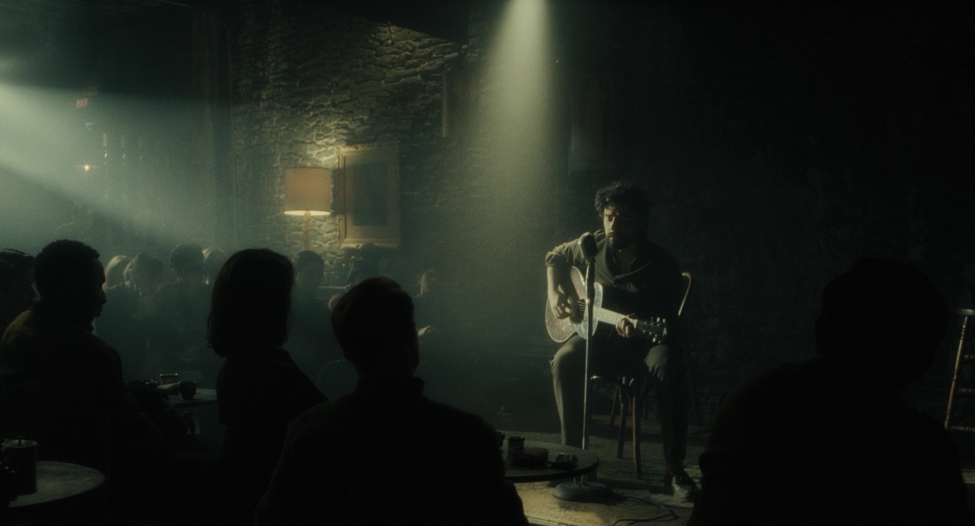
Ask Doyle to name his favorite looks, and he picks Faust, Inside Llewyn Davis and Tim Burton's Charlie and the Chocolate Factory. What links them, he says, is not the challenge. It is a creative team working as one.
"Production design, cinematography and direction were all working in sync," he says. "There was an environment where discovery, evolution and experimentation were encouraged. And there was an understanding that color grading can help bring a tone to the film."
On Faust, Alexander Sokurov's 2011 Golden Lion winner shot by Delbonnel, the team worked from the director's own watercolors. "It was very much an attempt at creating a true painterly feeling," Doyle says. "Alexander would paint using watercolors in the grading room, and then we would try to emulate that."
Look Development: Serve the production design
Inside Llewyn Davis was Doyle's first film with Joel and Ethan Coen, and another collaboration with Delbonnel.
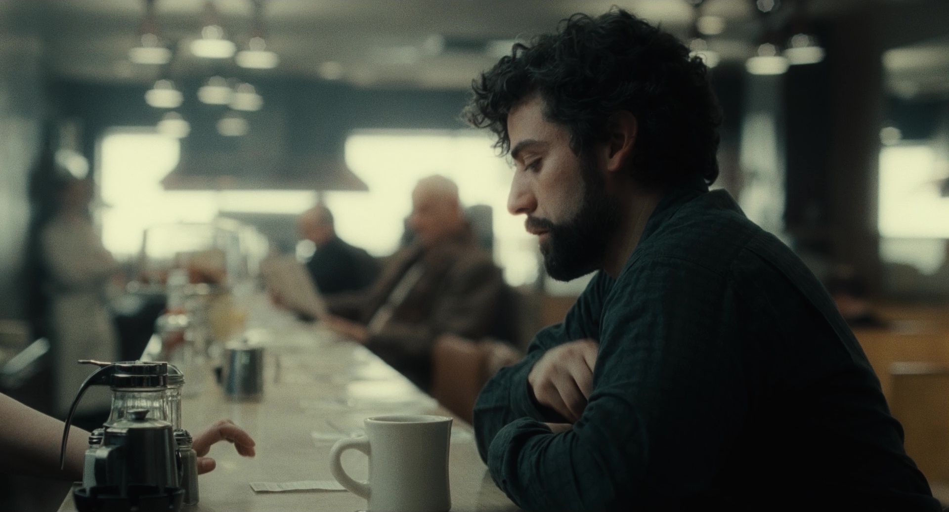
"The original brief was to make it feel like a 1960s album cover, a famous Bob Dylan one," he says. "But that's black and white, and none of us wanted a black and white film. Along the way we found that if we were distorting the colors too much, it actually detracted from the great production design. The team was spending a lot of time getting the production design to look like the '60s. So we just came up with the idea of making it look like a faded film, as if we really did go to the archive and pull this film out."
The look of Inside Llewyn Davis resonated with filmmakers, and many have cited that film as a reference.
"About two years ago, I actually got three calls from three different productions who wanted to know how to get the look of Inside Llewyn Davis," he says. "They were all doing New York in the '60s."
Look Development: How Doyle worked with Kramer Morgenthau ASC to create the three-dimensional skin tones of Creed III
On Creed III, Doyle worked with cinematographer Kramer Morgenthau, ASC. He is quick to credit the light for the film's three-dimensional skin tones.
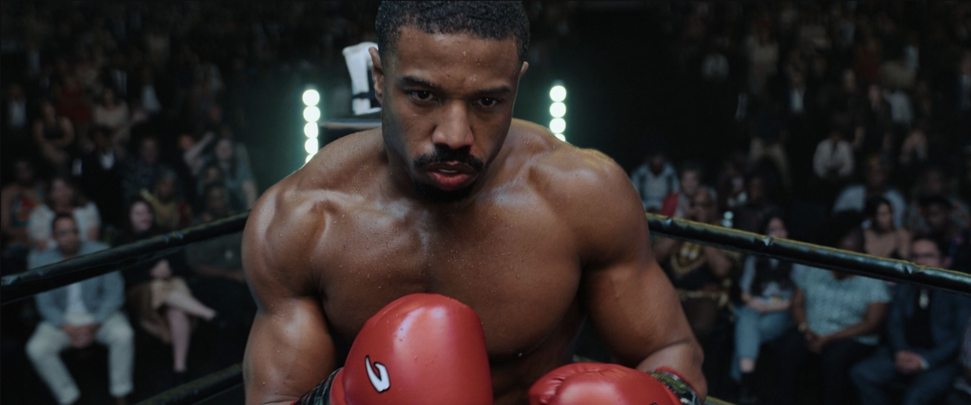
"It all comes from Kramer's light. It's very sculptural," he says. "Then it was shot with vintage Panavision anamorphic lenses, which give the image a distinctive rendering. The anamorphic format meant longer focal lengths and very shallow depth of field, and that separation of focus planes helps with depth perception. And then the third is the color design."
That color design uses what Doyle calls advancing and receding colors.
"Red is a strongly advancing color, and cyan-blue is a strongly receding color. When you juxtapose the two, you create a strong sense of depth. That's partly optical, because the eye focuses red and blue at slightly different depths, and partly learned, in how the brain reads the scene," he explains. "Think of any classic landscape. A mountain range fading into the distance turns bluer as it recedes, because the atmosphere scatters blue light between you and the mountains."
Look Development: Evolve from references, don't copy them
Digger reunites Iñárritu with cinematographer Emmanuel "Chivo" Lubezki, ASC, AMC for the first time since The Revenant. Doyle's look development started with their references.
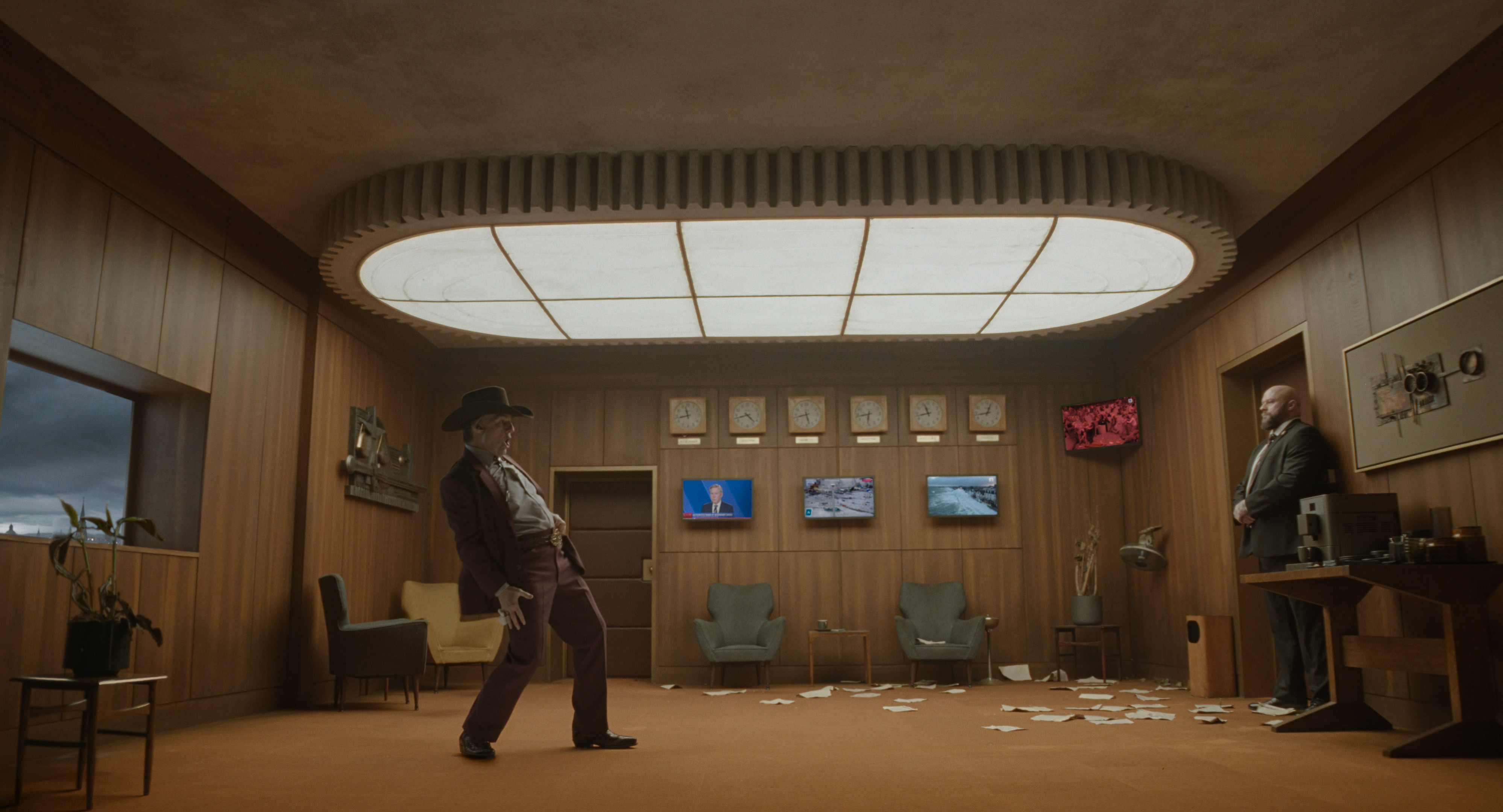
"Alejandro and Chivo had many, many references that were really talking points," Doyle says. "So it's really a question of evolution and just designing. What happens if we go from here, and what would it look like if we did this? It becomes a question of mutually suggesting and building on each other's ideas, even down to the ratio of the film. And working with production design, say the office, there's a lot of wood, which means it's very brown. How can you avoid it just becoming a complete brown wash?"
"For Digger, we built a fully calibrated color ecosystem in which on-set monitoring faithfully matched the developed and scanned VistaVision negative," Doyle says. "This allowed makeup, production design, lighting and CDLs to be refined on set, with complete confidence in how each choice would read on film. Color managed and projected in 4K, our dailies became, in effect, a live DI. In the final grade, the look continued to evolve in support of the final edit and VFX design, aided by a suite of custom plugins developed specifically for the film. In doing so, we married the best of two worlds: the 1950s technology of VistaVision and the tools of advanced color grading. The result is a nuanced and detailed grade that preserves the texture and scale of the practical set builds and highly detailed makeup design."
"The look for Digger was really about trying to create a tone and to really work on the two worlds," he says. "To create the feeling that something was just slightly off. The theatrical world was to feel real, but not quite real."
Better to create than to emulate
"Every film deserves its own look," Doyle says. "If we all reach for the same look, the images start to blur together, and the stories do too. We should be creating, not emulating."
Digger opens in theaters October 2 from Warner Bros. Pictures.